Personal Website Remastered
Personal Website Remastered
Janurary 2019
Task
Make a website from the scratch
- Make the website appeal to potential employers
- Follow the user research methods to test my website
- Sharpen my front-end programming skill
What I did
- Identified the stakeholders
- Prototyped on the papers and the Sketch app
- Wrote all the codes
- Showed it to people with employer experiences and friends, ask for their opinions
- Iterated on the opinions
Challenges
- Find enough testers for the website
- Really understood what is it that I would like to picture myself
What I learned
- Employers would want to know a lot about me in a short period
- So if something cannot be explained using two short sentences, skip the design
- But they would also want to know what kind of a person I am, and what values I can carry to their teams
- Fun title helps, but don't get too ambiguous; this is not YouTube and don't use thumbnails and titles to clickbait
This portfolio website was itself, of course, a design practice that involves many thoughts in it. It was hand-made completely from scratch since September 2018, and is still under construction up til this point. In this article I will explain how it was made.
Background
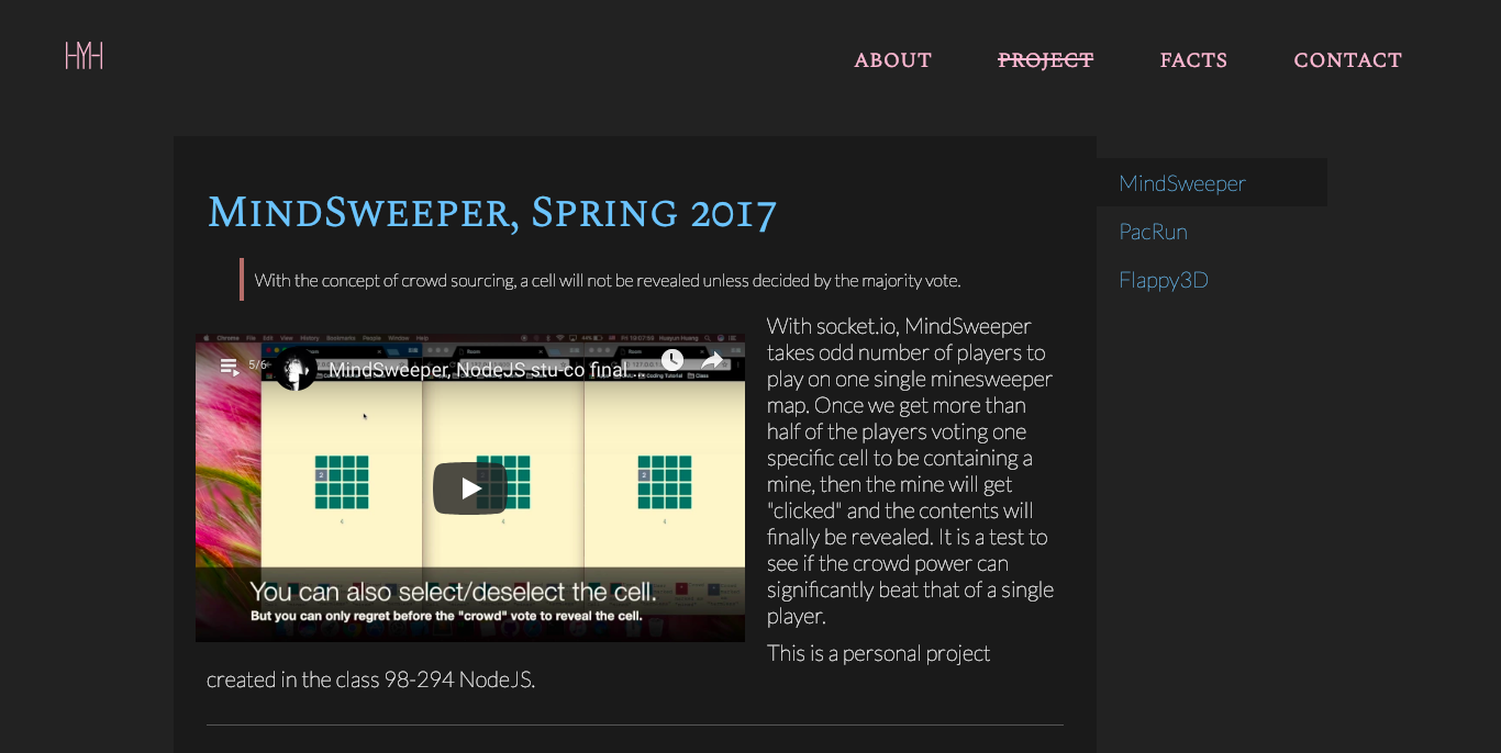
A screenshot from my old website. This is the portfolio page.
My previous personal website was a term project built during an HCI class called Programming Usable Interface. Like many of my other works, I injected tons of efforts into this project. However, the class was primarily focusing on the coding part, and the amount of time working on the project wasn't sufficient for me. As a result, the website does not accomplish all the design goals, and there were some design flaws.
In Fall 2018 I was preparing for all the job huntings, and I decided that it was about the time to work on the website. The major flaws of the old website were:
- Focused too much on its artistic value rather than on its visual readability
- Centered on "Huayun can be nice to talk to" rather than "Huayun can be valuable for our team"
- Not mobile-friendly enough
- Projects need to be elaborated
In a word, I believe it can be better, given what I learned in the past few months.
Audiences
The website is primarily designed for potential employers, including my potential direct boss, and the human resources people filtering for my resumes. In addition, my friends wondering about my past as a designer can also utilize the website as a point of reference.HCI? Ahh it sounds like artificial intelligence! With those in mind, I came up with four different stakeholders: direct employer, HR, friends, and me myself.
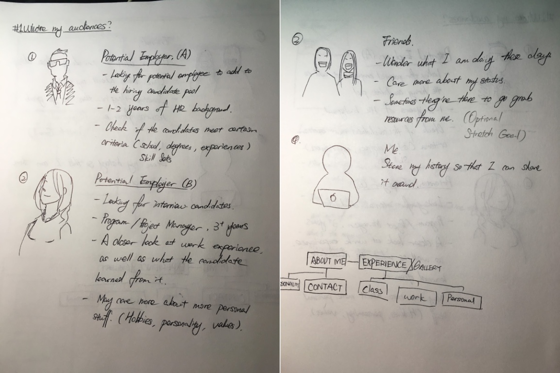
My four stakeholders for this project.
I would like to test my website out with those stakeholders -- especially the first one. I would want to point at my website during my interviews to better explain myself as a designer.
Prototypes

Hand-drawn low-fidelity prototypes
As I proceed to the actual appearance, I started with mobile prototype while bearing both the desktop view and the mobile view in my mind. Meanwhile, I also felt the need to design a logo to brand myself, which branched out into another project.
Iterations
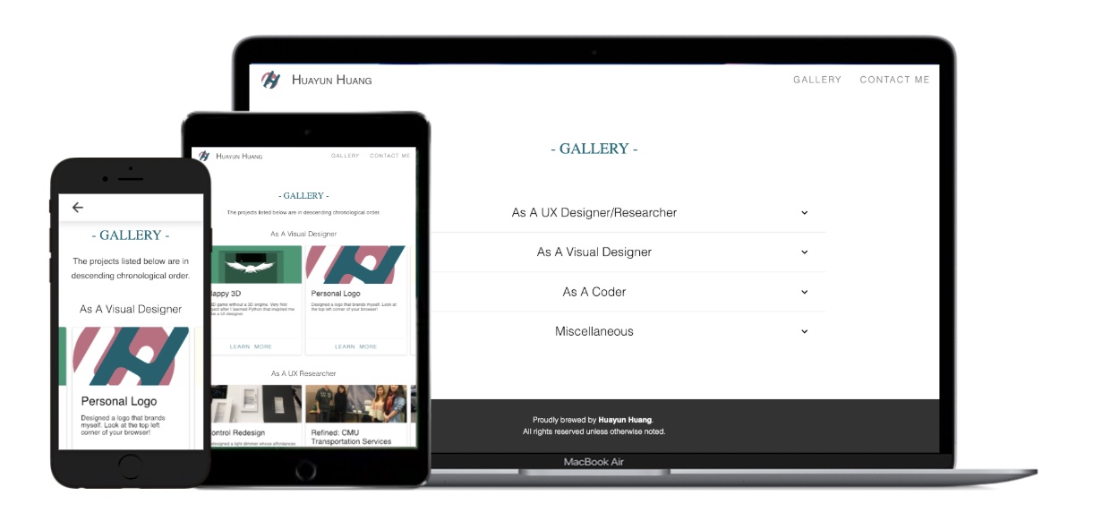
Making sure they works on different screens.
I implemented the website, and found some testers under the "direct employer" and "friends" category. Their feedbacks are written down in details in the process book. At first the suggestions were around "too many projects to digest". After the projects were re-organized, the suggestions were more towards the contents and other cosmetic issues.
The website is still being renovated. But please let me know if you have any suggestions!
Check out more
Refined: CMU Transportation Services
Quickly get new riders onboard via refined designs.