Personal Logo
Personal Logo
July 2018
Task
Design myself a logo that can be used for:
- Brand myself
- Practice my design skills
What I did
- Narrowed down my audiences
- Parallel prototyped
- Drew the final design using Illustrator
- Validated on different background color
Challenges
- Find a way to associate my name with graphics
- Balance the artistic value and the “meanings” behind a logo
What I learned
- Parallel prototyping really helps boost the creativity.
- Depending on the audiences, artistic value might matter more than the “meanings”.
- A good logo should work on all different kinds of background, dark, white, pink, green, without a big color contrast problem.
Just like actors have their stage names, writers have their pen names, as a designer I would like to have my own identity brandings as well. In order to visually impress people, as well as offering myself a design exercise, I decided to design myself a logo.
The logo that’s used on my previous personal website is a light pink logo, which is not very recognizable from a distance, and works only on a dark background.
The logo I used for my old website.
Because I decided to redesign the appearance of my personal website, I needed to redo the logo as well.
Procedure
Parallel prototyping is considered to be critical in staying creative and not getting stuck in one single idea.
Since this is a personal website, I started by exploring around my name, specifically my initials. “Huayun Huang” is a Chinese name, so “HYH”, “HHY”, “HY” and “HH” are all legit initials. Note both H and Y are symmetric letters.
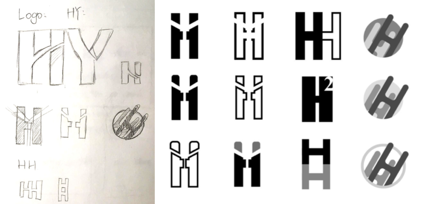
Low-Fi and Mid-Fi logo sketches.
I then selected two favorite designs from the medium fidelity logo, and explored them further with color variations. I think the first one is interesting in that it looks like two people shaking hands with each other; the second one looks better aesthetically, and my initials "HH" are more obvious.
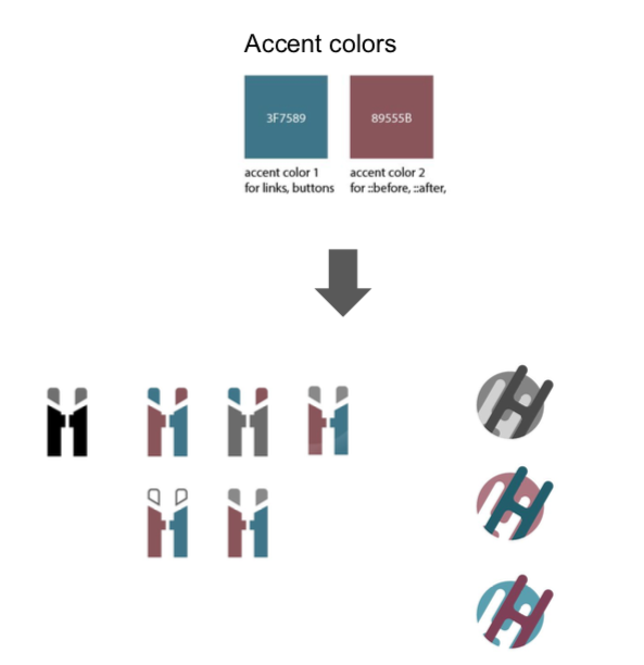
I tried coloring both with my website accent colors, with a little bit of variations for the contrast issue.
I decided that, after all, this is my personal portfolio website, and I want to show my graphic skills. I prefer being depicted as a fresh and energetic designer, instead of some business entity trying to trade with others, so I went with the “H-H” one (the one on the right), which I thought would appeal more to my employer personas of this website.
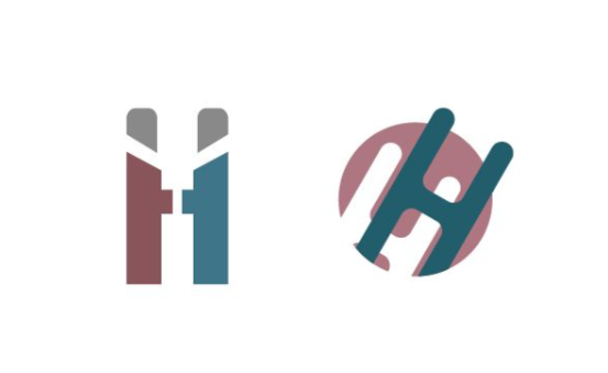
The HH one on the right wins. Despite of the fact that the left one is more “meaningful” and “friendly”, the one on the right is more visually pleasing and impressive as a PERSONAL website logo. However, if I were designing for a business context, I will pick the left one, for sure.
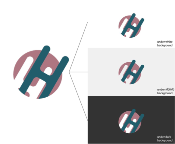
The logo under different background.
I checked the performance of this logo under several different background (white, #f0f0f0, #333). I think they all looked satisfactory to me.
The logo is now used on this website, which by itself is a design project.
Check out more
Wikipedia Asian Month Logo
Redesigned a logo for Wikipedia Asian Month, a Wikipedia article-writing contest.