Wikipedia Asian Month Logo
Wikipedia Asian Month Logo
June 2018
Redesigned the logo for a Wikipedia online writing event, based on my survey on asking people for their impressions on Asian culture. Pro bono for pro bono.
Task
Design a logo for Wikipedia that can be used for:
- Fund raising
- Representing the Asian culture
- Convey the Wikipedia identity (to emphasis that this is a Wikipedia event)
- Printing and displaying on various medias (T-shirts, websites, stickers, documents)
What I did
- Surveyed on several major Wikipedia communities to ask people their impressions about Asia
- Communicated with the event organizer to figure out what makes them unsatisfied about the current logo, and what their need is
- Drew the logo using Illustrator
Challenges
- Asia is too big and too diverse to be intergrated into one single tiny logo
- Eastern Asia has an overwhelming influence above other cultures (Arabics, India, etc.)
What I learned
- Logo plays a vital role in "evoking people's feelings"
- People from different cultural background see things differently.
Background
Wikipedia Asian Month (WAM) is one of the many online “Edit-A-Thon” events hosted by Wikipedia, the biggest (online) encyclopedia. Every November they gather editors ("Wikipedians") from various cultural backgrounds to write articles about Asian countries, hoping that this will increase people’s awareness to the Asian Culture.
Before I started, the WAM committee was using a very cartoony logo, which depicts Sun Wukong the Monkey King from Chinese mythologies. WAM committee was not satisfied with how it looks: Not only the cartoon-like logo is not artistic and serious enough and causes trouble during the fund raising, it does not convey any element about “Wikipedia”, either. Besides, the Sun logo is way too focused on the Chinese culture, yet besides China, the concept of Asia includes Middle East, South Asia, South East Asia, Siberia, and the rest of the East Asia as well.

Their logo before I started working on the project.
(Author: User:B20180, licensed under CC-by-SA 4.0, Source)
I was a WAM local organizer at Chinese Wikipedia during November 2017, and they noticed my active contribution as a local organizer and my design insights, so they requested me to redesign the logo.
Goal
Redesign the WAM logo that can be used for T-shirt, website, and fund raising.
Background Research
After I received the design specs, I decided to ask my fellow Wikipedians about what their perception is to the word “Asian” — that is, what is the most symbolic object they can think of when someone mentions “Asia”. This is to invoke an “Asian memory” for people within or outside of Asia, and to make the logo more recognizable, so that when they see the logo, they would immediately know that this is something about Asia and Wikipedia.
I asked people from English Wikipedia, the biggest wikipedia community of all time, as a representative for people from outside the Asia. I then asked people from Japanese Wikipedia, the largest Wikipedia in an Asian language (Technically the Vietnamese Wikipedia has more articles than Japanese Wikipedia, but their article base is mostly formed by bots creating articles automatically). Besides, I discussed with Chinese Wikipedians, as well as a friend of mine (an American) in real life.
From the audience study, I learned that many Westerners would only think about the East Asia, like China, Japan, Korea, when the word “Asian” is mentioned. Places like India and Arabic, although geologically belongs to Asia, won’t be the first thing that comes to their mind. I conclude that the East Asian culture needs to be slightly more heavily represented in the logo design.
Design
I came up with two designs:
- The first one is a Chinese-styled lantern, scattered into puzzle pieces (Puzzle piece is an alternate logo of Wikipedia, as derived from the Wiki-globe logo). The moon in the background is a nod to the Middle East crescent, and an indication of "MONth".
- The second one is more like a collage of several different Asian elements, all of which are selected based on people’s feedbacks.
Two pencil sketches for the logo design.
The first one is great for its aesthetic value, and also it can be easier to draw. However, the second one is more "comprehensive" in the messages it conveys. My client, the WAM committee, picked the latter one, as it serves as a unison of a multicultural background.
Wikipedia Asian Month Edit-a-thon version 2. The logo is composed of (top to bottom): 1. Desert camel trader; 2. Silk (Road); 3. (Star and) Crescent; 4. A typical eastern Asian architecture; 5. An elephant; 6. White tiger; 7. Tea and teapot; 8. Two lanterns. The "Wikipedia" font comes from the current English Wikipedia logo. The handwritten "ASIAN MONTH" credits to User:林立云.
(licensed under CC-by-SA 4.0, Source)
I further adjusted the color due to the technical limits (massively printed T shirts have a limited set of color to choose from). The final deliverable is drawn in Adobe Illustrator, and is hosted on Wikimedia Commons, shared publically under Creative Commons Licence.
The logo is well-received by the community. One Wikipedian even commented “It's the best logo for Wikipedia Asian Month... I can finally make a sticker of it and show it off on my laptop!”
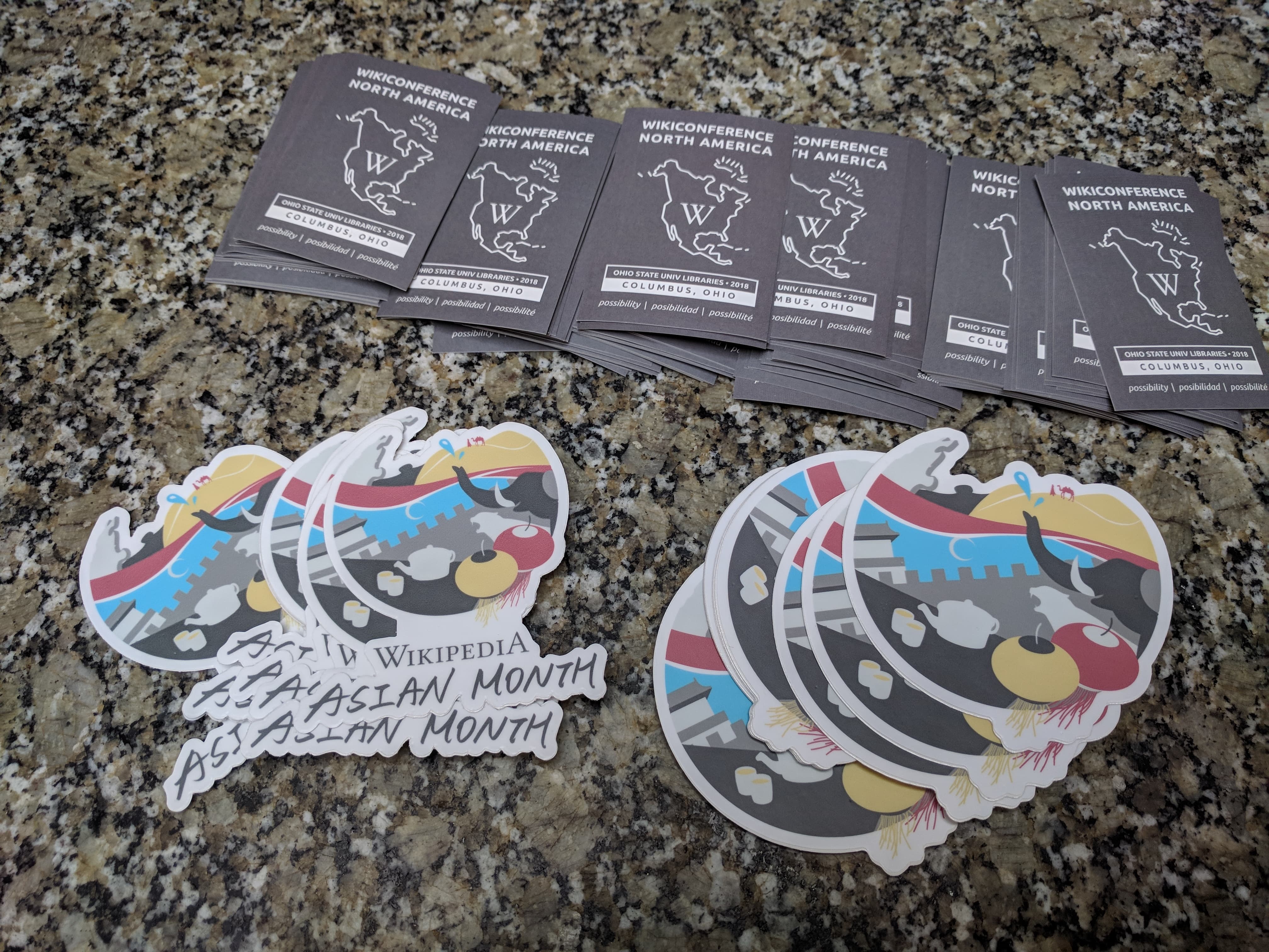
The sticker pack they made with my logo design on it.

During the November of 2018, my logo was used on Wikipedia sites in all languages.
Other Wikipedia logos
This is not my first time drawing a logo for Wikipedia. In April 2018 the Chinese Wikipedia reached its one million article milestone, and the community decided to change the Wikipedia logo to celebrate this achievement. The logo I designed received more than 70% of the total votes, and was displayed on the main page for two weeks.
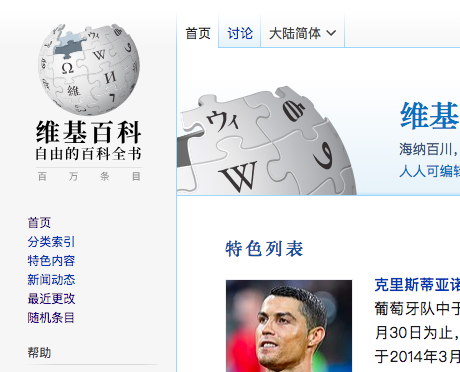
I added "百万条目" (one million articles) under the text "Wikipedia", and a semi-transparent puzzle piece on the Wikipedia logo, indicating that the Chinese wikipedia is one step closer to its perfection.
(licensed under CC-by-SA 4.0, Source)
This was the first time the Chinese Wikipedia community changed its logo in the past five years. The last time they did that was to celebrate the Spring Festival in 2013.
Check out more
Wherever There Is a Blank
How I use my drawing skills to "fill in the blanks".