Environmental Display for Transportation Hub
Environmental Display for Transportation Hub
September 2017
The San Juan Island has three different types of transportation methods: by plane, by ferry, and by train. How can we design an environmental display, such that people can view and plan their trip using the display?
Task
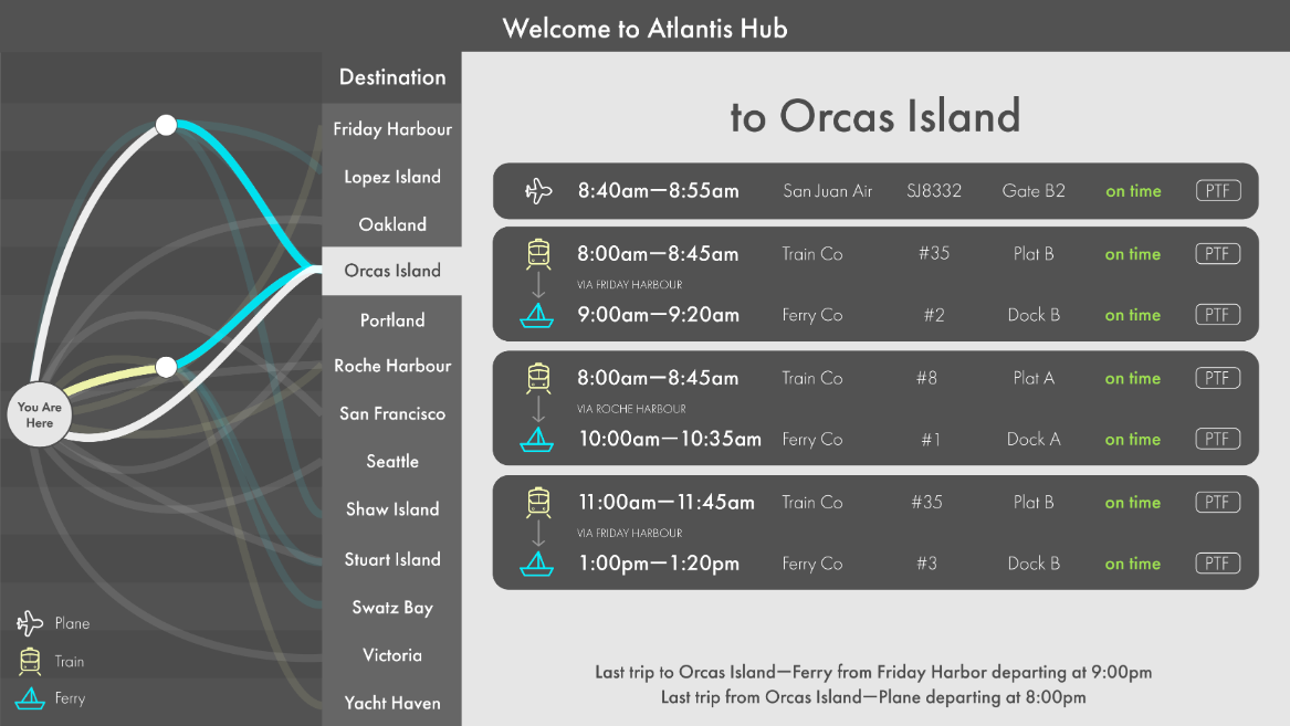
With a traditional display, it is very difficult to show connections and how travelers can reroute their trips on the fly in case of a cancellation. By diving deep and analyzing the data from the client, we were able to develop a new type of environmental display that organizes travel information into routes and combines clear route visualization with single destination focus that meets traveler’s needs.
I grouped with two other people, one bachelor student and one master student in HCI. I was the design person as well as the early stage sense making.
Detour
The details of this assignment can be examined in the process book. Here I would like to share what I have learned in this assignment.
When the assignment began, we were only given a big sheet of data, without any charts and graphs to help understand what the distribution of data looks like. In order to gain a general sense to what we have, I wrote some JavaScript code to visualize the data.
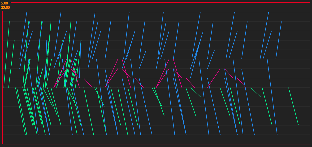
A quick visualization I generated with JavaScript to get a general idea of what the dataset looks like. The left to the right dimension is the time axis. The horizontal grids denote the station. The red lines denote the ferry trips, the green lines denote the train connections, and the green lines denote the flights.
This chart turned out to be extremely useful in understanding the data and the functions of this transportation hub. However, our mind got stuck with the chart, and what we ended up doing was more or less like a data visualization.
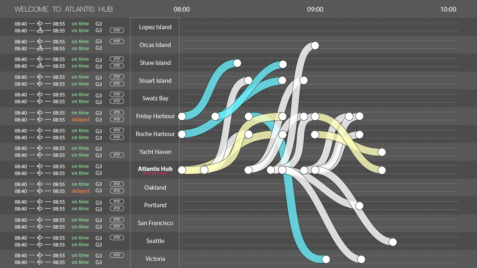
The "data visualization" display we created during an iteration.
We received feedbacks like “this is perfect for a dispatcher, but not for passengers”, and we realized that we might dive so deep that we created a Bloomberg-terminal-like interface -- efficient for professionals, but not for ordinary people.
Fortunately we realized the mistake before the final iteration.
From then on, I learned to really keep tight with the users' demand.
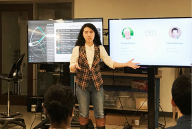
Me presenting to the rest of the class about the final screen.
Check out more
Control Redesign
Redesigned a light dimmer whose affordances encourage people to interact in an error-free way.